Placemate
Placemate is a recruitment platform focused on connecting students and early-career talent with employers offering internships, placements, and graduate opportunities. My role was to evaluate and redesign the core user experience to improve clarity, usability, and conversion across the candidate journey.
Problem
The existing platform presented significant usability challenges, particularly across the early stages of the user journey. Key flows such as registration, profile completion, and initial job application lacked clarity and effective signposting.
Users struggled to understand what actions to take, where to navigate next, and how to successfully progress toward applying for roles. This resulted in confusion, drop-off, and an overall fragmented experience.
Process
Following initial stakeholder engagement, it was clear that a research-led approach was required to validate assumptions and uncover specific usability issues.
I conducted a heuristic evaluation of the existing platform to identify structural and interaction-level issues. This was complemented by moderated usability testing with participants from the target demographic.
Across multiple sessions, consistent patterns emerged. Users experienced difficulty completing key tasks, frequently encountering friction in navigation, unclear calls to action, and cognitive overload caused by unnecessary content and visual noise.
These insights provided a clear direction: simplify the experience, prioritise user intent, and remove anything that did not directly support task completion.
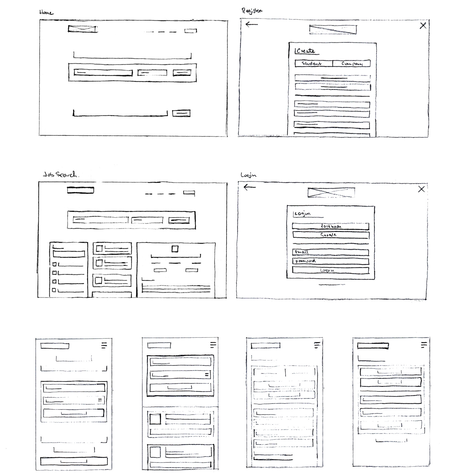
Design Exploration
With user feedback informing the approach, I focused on redefining the core experience, particularly the search and discovery layer, as well as the homepage entry point.
Through rapid sketching and iterative layout exploration, I tested multiple approaches to hierarchy, content structure, and interaction patterns. Regular critique and collaboration with other designers helped refine the direction.
A clear principle emerged throughout this phase: reducing complexity significantly improved usability. Stripping back non-essential elements allowed key actions and pathways to become more visible and intuitive.
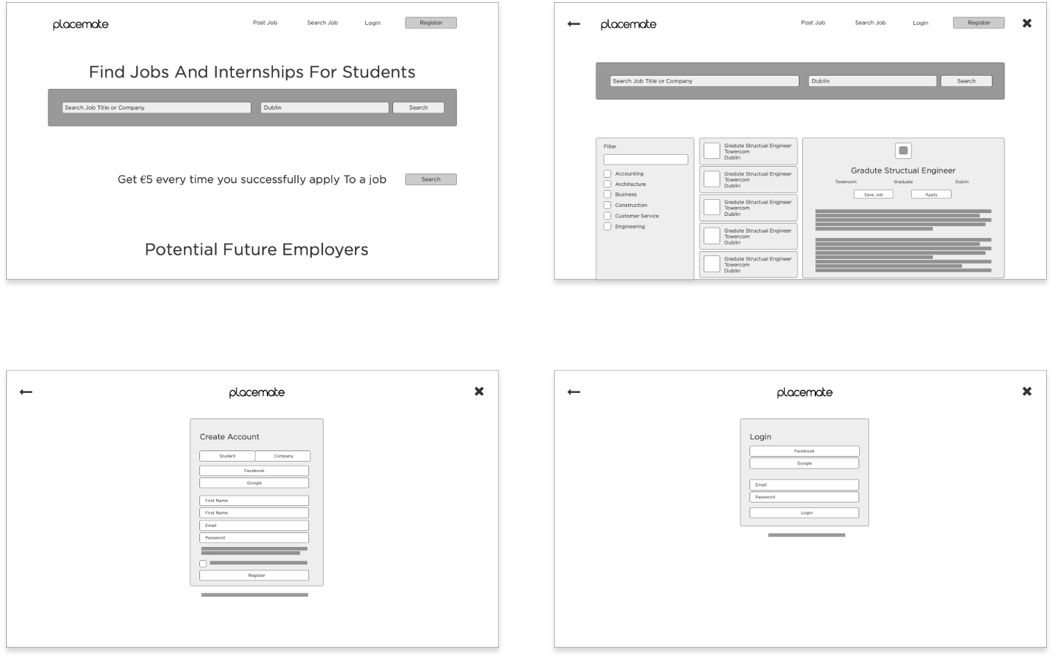
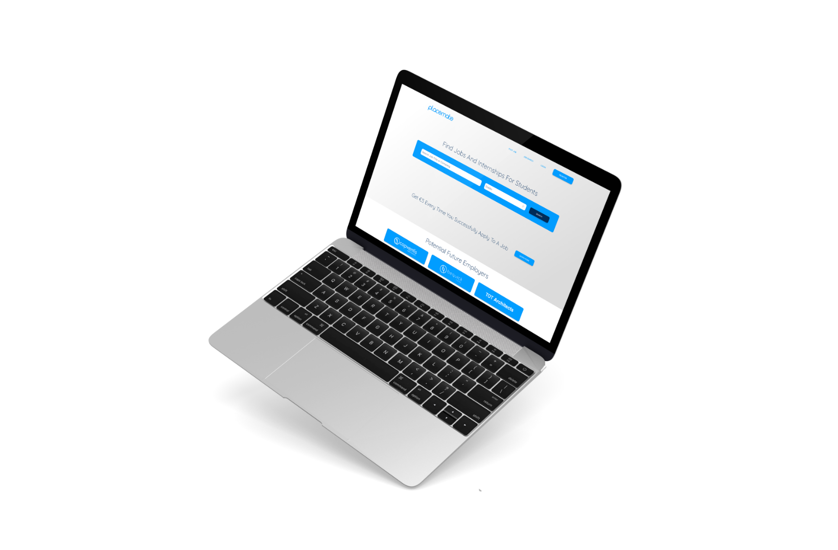
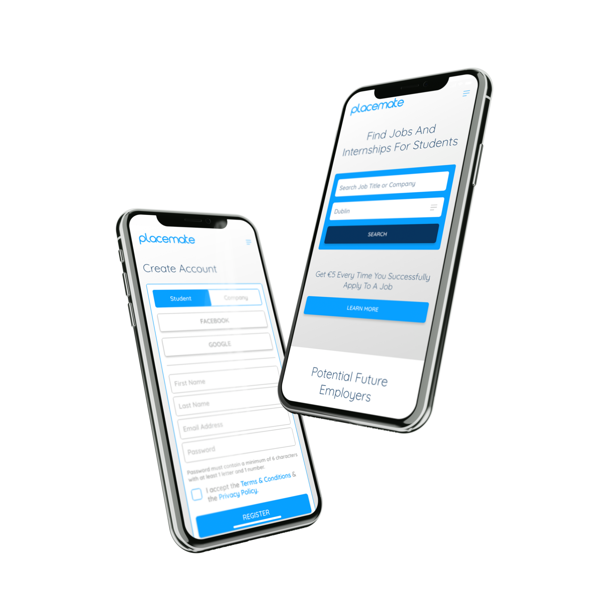
Prototyping & UI Design
Building on approved wireframes, I developed high-fidelity prototypes in Adobe XD, translating the simplified structure into a cohesive visual experience.
The interface leveraged a clear typographic hierarchy and a consistent colour system, aligned with updated brand guidelines. A vibrant blue accent was introduced to create a more approachable and engaging aesthetic, while also supporting interaction cues and visual clarity.
The result was a clean, responsive design that guided users naturally through the journey, from onboarding to job application.
Outcomes
User testing of the existing platform confirmed stakeholder concerns: users were consistently unable to complete key tasks and were becoming frustrated at predictable points in the journey.
Through research and redesign, I was able to identify and address the exact moments where users experienced friction. Post-testing feedback highlighted improved clarity, reduced cognitive load, and a more intuitive progression through the platform.
This project reinforced a fundamental design principle: effective user experiences are achieved not by adding more, but by removing unnecessary complexity and focusing on what users truly need to accomplish their goals.